
It has been much too long since my last post on the power of collaboration with WKO4 so in the sole interest of breaking the silence today's post will be brief.
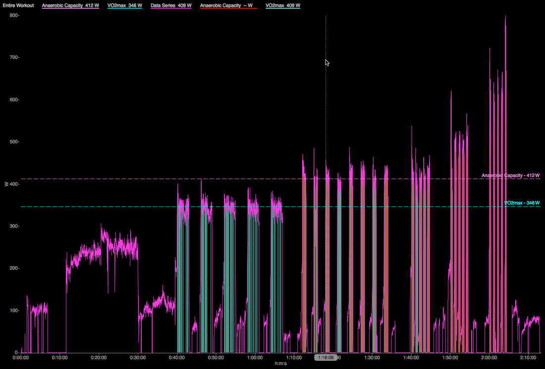
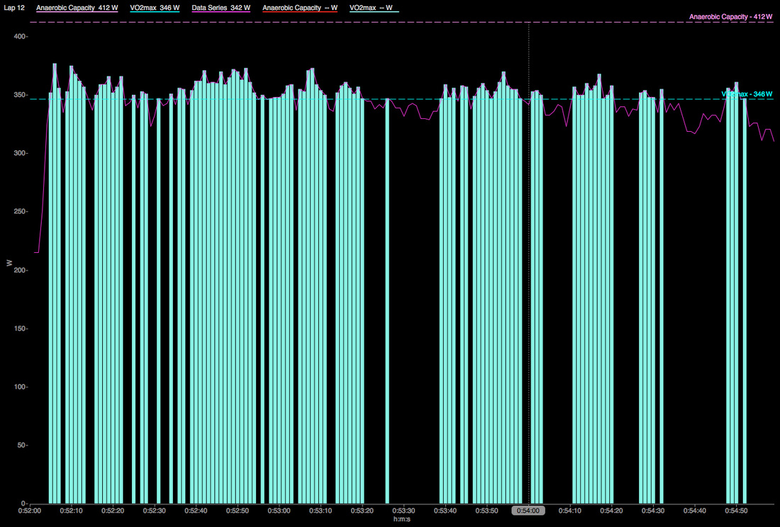
One of my favorite features from WKO 3 was 'fast find' which allowed me to tell the software what I determined to be a match and then set up parameters to go and find those matches, but as great as this was it was a tedious process and often times took a lot of trial and error. I recently caught wind that a coach in Korea had created a chart in WKO4 that would find matches. I located the chart and downloaded it and but it wasn't exactly what I was looking for. This coach's chart was looking for power values above certain peaks and then changing the power channel to a different color while I wanted something that would highlight intervals. Alas, that is the beauty of WKO4. I was able to see what he was doing by looking at the expressions and then go in and tweak them until I got the information that I thought was important. In my chart I told the software to look for certain percentages above set FTP and then add different colored bars to those values in order to highlight those intervals (below). Another unexpected benefit of this method is that by zooming in on an interval, it makes it very easy to see when the athlete was above or below the target value (bottom image)
You can download the chart here. While it may not be exactly what you are looking for hopefully it will get the wheels turning and inspire you to build upon it, create something better, and then reshare it with the world.
 RSS Feed
